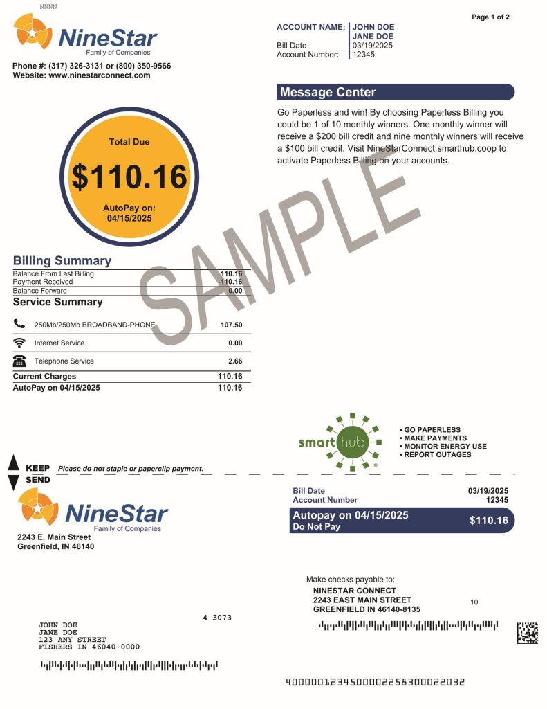
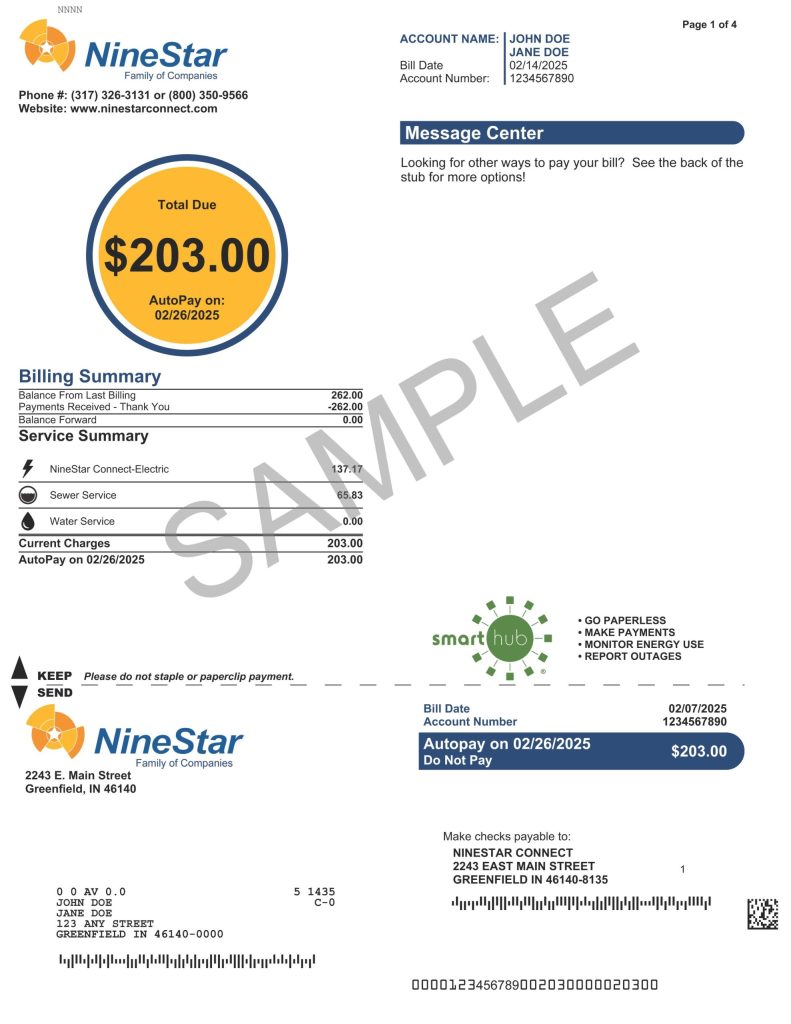
Exciting New Features on Your Bill
A Fresh Look at Your Energy and/or Water Usage:
A New Way to Visualize Your Energy Usage
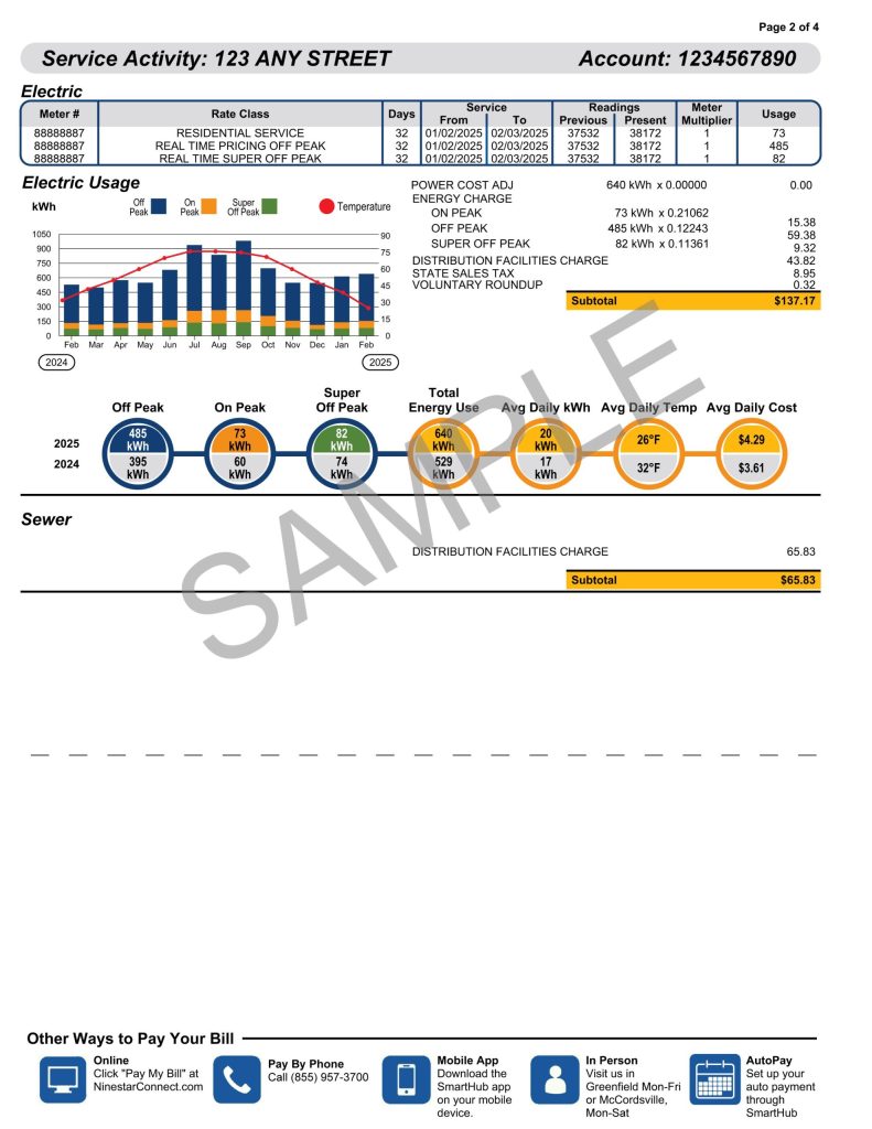
One of the highlights of our new billing format is the addition of two informative graphs. These graphs give you a clear picture of your energy usage throughout the month, including the different time-of-day pricing periods that matter most to you. Here’s what you can expect:
- Monthly kWh Usage by Time Period
This graph breaks down your energy consumption into three time periods:- Off Peak
- On Peak
- Super Off Peak
It gives you a detailed view of how much energy you used during each period, helping you identify opportunities to shift your energy use to more affordable times.
- Temperature Variation Comparison
Alongside your energy usage, we’ve also included a temperature graph. This lets you see how temperature fluctuations might have affected your energy consumption during the month. It’s a helpful way to understand if changes in weather had an impact on your overall bill.
The Dial Graph: Your Quick Snapshot of Usage and Costs
We’re also introducing a Dial Graph that condenses your usage data into a simple, easy-to-read format. Here’s what you’ll see:
- Total Energy Usage: The total kWh used during off peak, on peak, and super off peak periods.
- Average Daily kWh: How much energy you used, on average, each day.
- Average Temperature: A daily average temperature for the month.
- Average Daily Cost: A snapshot of how much you spent per day on average, giving you a quick overview of your energy costs.
With these added features, you’ll be able to make more informed decisions about your energy consumption, potentially saving money by adjusting your usage habits.
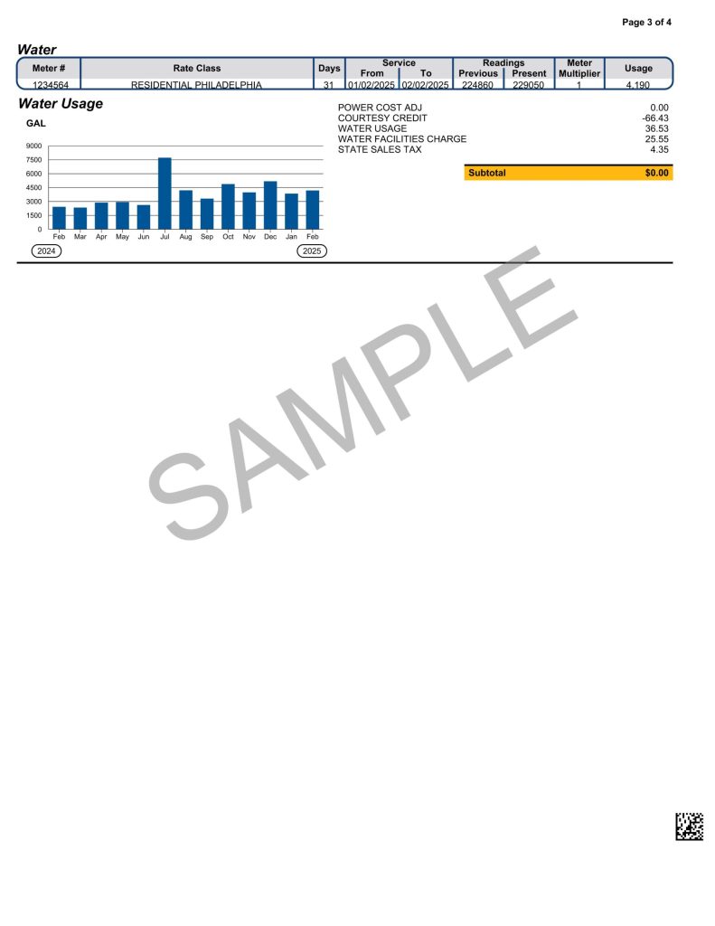
Water Usage Graph
We have included a gallon usage graph for all water customers so that you are able to view your consumption by month.
Why This Upgrade Matters
We understand that understanding your bill can sometimes be a challenge, especially when it comes to breaking down energy usage across different pricing periods. Our goal with this upgrade is to give you more visibility and control over your energy usage. Whether you’re trying to cut down on your energy costs or just want to be more informed about your habits, these new graphs and features provide valuable insights into how you use energy.
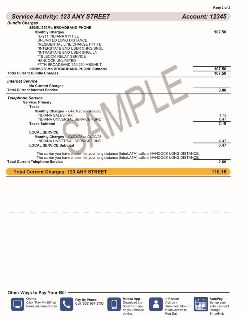
A new look on your internet bill:
